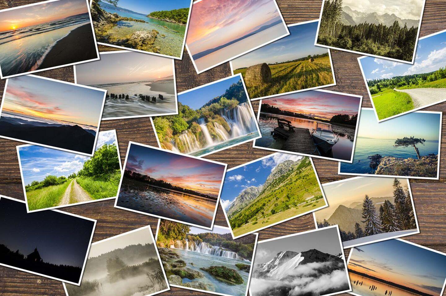
Capturing the perfect moment during your travels? Learn how to organize and curate an album of your best travel photos so you can reminisce for years to come.

Compiling a travel photo album is an art form that can effectively narrate rich and unique experiences. Whether you’re a seasoned globetrotter or a casual vacationer, learning how to create an exceptional travel album involves more than just the random placement of pictures.
How to Create a Stunning Travel Album
Creating an incredible album requires thoughtful planning, a good eye for design, creativity, technique, and the following 10 things. Follow them to a T to get an album you want to share.
Select Your Best Shots
With so many memories captured, each photo feels precious and irreplaceable. However, keep in mind that your album aims to provide a riveting glimpse into your travels. For this reason, dive deep into your collection and pick out images that radiate charm and excitement for you.
The photos you select should convey a story or emotion and collectively encapsulate the essence of your entire journey. You’ll want to make a lasting statement to album readers.
Organize Your Photos
Sequencing your photos in a logical and coherent manner helps shape narratives that keep viewers engaged. You could organize them geographically if you’ve traveled to multiple regions or chronologically if you’re on a single extended trip. Either way, both will tell a story.
A strong narrative flow not only makes your album more visually appealing but also provides a clear context behind each memory, making it an enjoyable journey for all observers.
Use Photo Editing Tools
Editing is not about altering the truth but enhancing the beauty that already exists within the frame. Small touch-ups like adjusting brightness or contrast, cropping for better framing, or even using creative photo manipulations through tools like Picsart for background removal can greatly augment your photo’s allure to viewers.
The goal is to emphasize the key elements of each shot and ensure the colors are vibrant and true to life. Keep subtlety in mind when editing, as you only need small changes for most photos.
Incorporate Variety
It’s often said that variety is the spice of life, and this couldn’t ring truer when it’s about crafting an engaging album. Integrating a mix of landscapes, architecture, street life, or portraits not only provides visual relief to viewers but also adds depth and dimension to your narrative.
It attracts viewer attention through differing focuses and perspectives. Such combinations create textures in your album that captivate audiences as they flip through your vibrant chronicle.
Provide Context
Providing context in the form of captions or short notes allows viewers to understand your experiences and interact with your memories more intimately. It could be a brief note about the person you’ve photographed or a description of what made that moment significant for you.
These contextual bits of information can play a major role in how much another individual relates to, appreciates, and takes away from your shared travel experience.
Choose a Consistent Theme
A theme helps tie together diverse experiences and locations into a unified body of work that communicates a specific mood or message. It could be anything from a dominant color that permeates throughout the images, a perspective, or a certain aesthetic style like minimalism.
For instance, black and white photography has the ability to stir deep emotions, while photos emphasized by leading lines can create depth and interest in each frame.
Try Different Layouts
Playing with different placements, orientations, and space utilization instantly adds interest and infuses dynamism into your photo album pages. For instance, pairing panoramic images with vertical snaps or close-ups against long shots can create a striking visual contrast.
Similarly, blend different-sized pictures on one page to keep the viewers guessing what comes next. It invokes curiosity and induces excitement as they meander through your travelogs.
Make Use of White Spaces
White spaces, also known as negative spaces, are often underestimated in the process of album creation, but they possess immense potential for enhancing the impact of your photos. White space around your images helps with visual clarity by avoiding a cluttered feel.
This design technique draws the viewer’s attention more directly to your images, emphasizing their individual beauty and significance in stark contrast against the blank background.
Showcase People and Relationships
When curating your travel album, remember to include the human element. AKA, images that document people you’ve met and relationships you’ve forged during your travels. These could be laughs shared with a local or the candid expressions of a group of people you chanced upon.
Photographs capturing genuine emotions and authentic moments add a heartwarming layer to your travel narratives. They break away from clichéd scenery and architecture.
Review and Revise
Always make sure to take a step back and evaluate your hard work. Page through it from start to finish, scrutinizing every detail with a fresh eye. See if the flow is steady and coherent.
Consider little tweaks you can make, like switching the photo order, tweaking a caption, or redefining white space usage, until it feels just right. This ongoing review process ensures that your album resonates with your travel experiences and truly captures the heart of your journey.
In Conclusion…
The process of creating a memorable travel photo album is as exciting and fulfilling as the journeys it represents. So grab your travel photos, unleash your creativity, and start weaving them together into an exceptional narrative that drips with personal style, vibrancy, and emotion.